英断。そうなんですよ、Times New Romanて意外と目への負担が大きくて、疲れるんですよ。私も手元ではCalibri使ってる。フォントが選べるようになった世の中は素晴らしい(90年代は英語問題集も試験問題もTines New Romanしか使えなかった。少なくとも私の環境では)
RT @John_Hudson@twitter.com
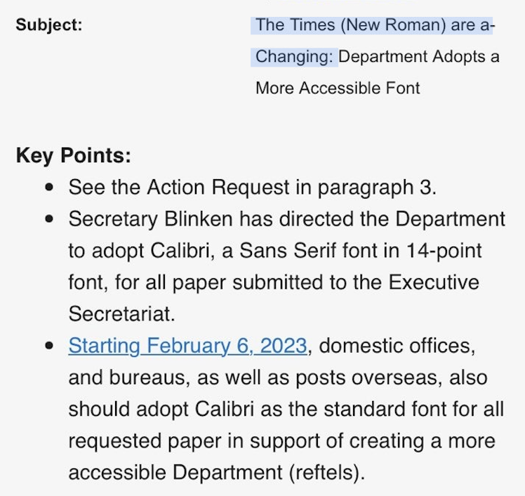
big news for font freaks: Times New Roman is being phased out at the State Department & replaced by Calibri. Secretary Blinken sent a cable to all embassies today directing staff not to send him any more papers with Times New Roman. Subject: "The Times (New Roman) are a-Changin"
🐦🔗: https://twitter.com/John_Hudson/status/1615486867712999426


